
:max_bytes(150000):strip_icc():format(webp)/GettyImages-Macys-59e6c3699abed500118af858.jpg)
How to Add Green Screen Effects In Phhotoshop
How to Add Green Screen Effects In Phhotoshop
Removing green screen backgrounds and replacing them with stunning videos is a common practice in video and movie making. The same process is applicable to still photos as well. You can take a photo with a green screen background and replace the screen with any photo as per your preference and requirement. You will need a high-quality photo editor to add green screen effects to your photo. There is no better photo editor in the world than Adobe Photoshop.
First, you have to opt for remove green screen Photoshop and then add anything you want in place of the green screen. The difference between Chroma key Photoshop and any other photo editor is that you can pay attention to details and remove the entire green screen halo effect around the main subject or object on the photo. Therefore, there will be no jittery green edges and green patches to disturb the overall photo quality. Here are the steps to use green screen effect in Adobe Photoshop.
1. How To Use Green Screen in Photoshop?
There are various ways available to remove greenscreen Photoshop. The beginners prefer using the Magic Wand tool but there will always be green patches around the main object on the photo. These green patches will get highlighted when you insert any image in the background. Therefore, we are using the best method to Chroma key Photoshop and that is through Color Range option. Here are the detailed steps to use color keying in Photoshop to use green screen effect.
Step 1: Launch Adobe Photoshop and open your photo with green screen background.
Step 2: Go to Select menu and click on Color Range.

Step 3: Pick the Eyedropper tool. Hold Shift key to select the green background. You can also hold Alt key to remove any selection that you might have done by mistake. When you are perfectly ok with the selection of the green screen background, you should click on OK button.

Step 3: Go to Select menu and click on Inverse. Now, the selection will be on the main subject instead of the background.

Step 4: If you want to see a preview of the selection in your photo, you should select Image radio button and from Selection Preview, select any option other than None.

Step 5: Go to Select menu again and click on Refine Edge. Use the sliders to fine-tune the selection so that the selection is smooth on the edges of the main subject of the photo. Once done, click on OK button.

Step 6: Go to Select menu and click on Inverse again.
Step 7: Press Delete key to delete the green screen background selection.
Step 8: Open the replacement image which you want to put in the place of the green screen background that you have just deleted.
Step 9: Select the entire replacement image and copy the replacement. Come back to your photo and paste the replacement image. Make sure that the layer of the replacement image must be placed below the layer of your photo.

Step 10: You can adjust the size of the images as per your requirement so that everything fits perfectly in the frame. Similarly, you should adjust the color scheme so that the superimposition does not look awkward.
2. Best Way To Add Green Screen Effect To Video
In the previous section, we have stated how to remove the green screen background in any image and replace that with a stunning background photo. In this section, we will state how to add green screen effects in a video. There are many who think that adding green screen effects in a video takes a lot of expertise, but it is not the case.
If you select the suitable video editor, it is a matter of a few steps only. We recommend Wondershare Filmora to add green screen effects to your video where you have shot the scenes with green screen backgrounds. Here are the steps to follow to remove green screen backgrounds and replace with any photo or video as per your preference.
For Win 7 or later (64-bit)
For macOS 10.12 or later
Step 1: Download and install Wondershare Filmora.
Step 2: Launch Filmora and go for Create New Project option to get started.
Step 3: Import your video with green screen background and move it to the Timeline.
Step 4: Import the replacement photo or video and put it directly on the Timeline.
On the Timeline, your recorded video should be below the replacement photo or video.
Step 5: Double-click on your video, and you will come across a panel on the upper-left side. From that panel, you have to turn on Chroma Key option. This will enable the green screen effect due to which you will see the replacement photo or video superimposed on your recorded video in the green screen background.

Step 6: Finally, adjust the parameters available to fine-tune the overall green screen effect. Lastly, click on Ok button.
Conclusion
If you are looking to add green screen effects to your photo, you can opt for Chroma key Photoshop. Adobe Photoshop is the best photo editor to remove the green screen backgrounds on your photo and replace them with any image you want. Color keying in Photoshop enables you to change any solid color background to anything you want. Similarly, you can use Wondershare Filmora to add green screen effects to your video in simple steps.
For macOS 10.12 or later
Step 1: Download and install Wondershare Filmora.
Step 2: Launch Filmora and go for Create New Project option to get started.
Step 3: Import your video with green screen background and move it to the Timeline.
Step 4: Import the replacement photo or video and put it directly on the Timeline.
On the Timeline, your recorded video should be below the replacement photo or video.
Step 5: Double-click on your video, and you will come across a panel on the upper-left side. From that panel, you have to turn on Chroma Key option. This will enable the green screen effect due to which you will see the replacement photo or video superimposed on your recorded video in the green screen background.
Step 6: Finally, adjust the parameters available to fine-tune the overall green screen effect. Lastly, click on Ok button.
Conclusion
If you are looking to add green screen effects to your photo, you can opt for Chroma key Photoshop. Adobe Photoshop is the best photo editor to remove the green screen backgrounds on your photo and replace them with any image you want. Color keying in Photoshop enables you to change any solid color background to anything you want. Similarly, you can use Wondershare Filmora to add green screen effects to your video in simple steps.
10 Matching Color Combination That Works Together Greatly
10 Matching Color Combination That Works Together
An easy yet powerful editor
Numerous effects to choose from
Detailed tutorials provided by the official channel
Color is abundant in our life. Our moods, sensations, and perceptions, as well as our decision-making processes, are all influenced by color. Emotion evokes by color. It affects our perception, eliciting subconscious or conscious responses in the human brain. Color is perhaps the most robust tool at your disposal as a designer because of its influential and communicative nature.

Although not everyone is born with a keen sense of color or a natural aptitude for graphic design, there are methods and principles you can employ to select the best color that matches together to make a strong impression and achieve your desired effect. Fortunately, we’ve got you backed up. The ten best colors that match everything are listed below to help you create your next design.
In this article
01 [What is a color combination?](#Part 1)
02 [Types of color combinations](#Part 2)
03 [Two-color combination vs. Three-color logo combinations](#Part 3)
04 [How to apply color combinations to your designs?](#Part 4)
Part 1 What is Color Combination?
Color Theory is an art when it comes to playing with colors. It explains how people perceive color and the visual effects of colors mixing, pairing, and contrasting with one another. Designers use a color wheel and considerable collected knowledge about human psychology, society, and more to pick the perfect colors that match everything. Color is a crucial, if not the most important, feature of design since it may affect the meaning of the text, how people move across a layout, and how they feel. You may be more intentional in generating graphics that affect you if you understand color theory.
Part 2 Types of Color Combinations
Learning how different colors match together is essential for successful color combinations. Studying the color wheel and color harmonies (what works, what doesn’t, and how color communicates) will help you blend colors, establish a stronger brand, and share more effectively with your designers and printers.
The color wheel contains:?
● Three primary colors (red, yellow, and blue),?
● Three secondary colors (purple, green, and orange), and?
● Six tertiary colors (colors generated when you mix primary colors), plus (colors created from primary and secondary colors, such as blue-green or red-violet).

Draw a line over the core of the wheel to separate the warm colors (reds, oranges, and yellows) from the cool colors (blues, greens, and purples) (blues, greens, purples).
Warm colors are connected with activity, brightness, and vigor, whereas cold colors are associated with tranquility, peace, and serenity. So when you hold that color has a temperature, you can see how its use might influence your message.
On the color wheel, complementary hues are opposites. They may make artwork jump because of the great contrast between the two hues, but overusing them can get tiring.
Analogous hues are next to each other. Therefore, one color will dominate, one will support, and another will accent when developing a similar color scheme.
Triadic hues are energetic and vibrant, evenly dispersed throughout the color wheel. They provide visual contrast and harmony, allowing everything to shine as the overall image comes to life.
You can build a variety of grand color schemes by using the color wheel. Finding the perfect color combination for the right occasion is vital.
● 10 Matching Color Combination That Works Together
01Yellow and Blue

Yellow is the ultimate attention-getter, and it provides a young backdrop for the commanding navy. The equally electrifying Blue color that matches with Yellow dazzles the senses. It’s one of those color schemes mainly used for parties and casual gatherings. It helps instill a sense of purpose and energy in a design by contributing to enthusiasm.
02Black and Orange

The vibrant orange contrasts wonderfully with the dark black, providing a sense of mystery and suspense. Black is one of my favorite colors that match with orange.
03Lime Green and Purple

This high-octane color combination exudes a powerful presence, with purple being a beautiful choice to compliment light green. That?**color matches the lime green?**and presents a strong sense of design.?
04Dark Brown and Yellow

This fantastic color combination is ideal for creating a design that shouts spontaneity and dependability. The perfect tag-team, marigold yellow, catches the eye while dark brown keeps it. Yellow is yet another favorite pick of color that matches dark brown.
05Lavender and Indigo

Indigo, a dramatic color associated with the arts, is intuitive and forceful. It creates an exciting backdrop for the softer purple shade.
06Turquoise Blue and Purple

The imaginative purple and waterleaf turquoise combination create an overall sensation of limitless possibilities. These colors are ideal for communication-related businesses, such as teachers, trainers, and media communication. Purple is the choice of many designers, and this color matches turquoise blue perfectly.
07Light Pink, Hot Pink & Maroon

The pink color family is your best pick if you’re looking for a design that shouts “approachable.” These colors are distinct enough to provide visual interest to the design while remaining similar sufficient to maintain an innocent appearance. When you add maroon to the mix, you reduce the chance of appearing foolish while also exuding just the appropriate amount of professionalism. Hot Pink and Maroon are my top picks for a color that matches light pink.
08Light Gray and Desert Sand Beige

Although desert sand beige is one of the least-used design colors, it will make you stand out if you use it. For fashion or interior design brands, the tones of desert sand and emperor gray work nicely together.
09Dark Sea Green and Deep Forest Green

Forest green is a color that conjures up images of nature just by its name. This adaptable color connects with growth, and it looks cool and fresh when coupled with lighter seafoam green.
10Dark Blue, Turquoise, Beige

These colors go well together and reinforce the brand’s reliability. When you combine them with the beige backdrop, you feel secure exploring and pursuing. This color combination functions well for vacation, life consulting, and healthcare businesses.
Part 3 Two Color Combination vs. Three Color Combination
The choice is yours to decide. Colors have a significant role in your brand’s identification. After you’ve decided on the style of logo you want to employ, think about what each color will say about your business. Check for the feelings you want to evoke and how you want your customers to react to your brand. You can assist your brand leave a lasting impression and forming a stronger connection with your audience by selecting the proper color combination.
Part 4 How to Apply Color Combinations to Your Designs?
Specific color combinations have the power to catch our attention, generate emotion, and ultimately make a lasting statement.
In this section, we’ll look at some great colors that match together and can help your brand make a significant impact, along with a step guide on how you can easily color match during video editing.
0110 Beautiful Color Combinations for Your Next Design
● You can produce all kinds of grand color schemes with the color wheel. Find the right color pairing for the right occasion.
● Yellow, magenta, cyan, and black

Hex code: #e2d810, #d9138a, #12a4d9 and #322e2f
Almost each print project is dependent upon these four ink colors. They can create any color imaginable after they combine. Individually, they make a color scheme that’s bright, contemporary, and full of life.
● Shades of pink and brown

Hex code: #e75874, #be1558, #fbcbc9 and #322514
Pink is youthful, modern, and luxurious, and using different shades adds even more motion and depth to the design. Combining pink with dark brown adds a basic level of contrast and seriousness.
● Gold, charcoal, and grey

Hex code: #ef9d10f, #3b4d61 and #6b7b8c
It is a perfect merge of seriousness and sunshine. The gold represents nature and cheerfulness, which combines perfectly with two different shades of black and grey that add a layer of maturity.
● Tan, deep turquoise, and black

Hex code: #ecc19c, #1e847f, #000000
Over a natural, masculine tan base, this merge presents turquoise to the forefront to display its utility as a color that displays nature and rebirth.
● Raspberry and shades of blue

Hex code: #8a307f, #79a7d3, #6883bc
Like the palette above, trusted blue forms the foundation of this combination, while the pinkish-purple addition of raspberry adds luxurious femininity.
● Sea-foam, salmon, and navy

Hex code: #aed6dc, #ff9a8d, #4a536b
The ideal beachy palette. This unique pastel combination of salmon, sea-foam, and navy represents everyone’s favorite coastal colors and shows the warmth and peacefulness that comes from a day at the ocean.
● Yellow-green, olive, and forest green

Hex code: #e1dd72, #a8c66c, #1b6535
These three color combinations of green are the perfect palette for this lime and mint beverage. They both combine into a brilliant blend of excitement and youthfulness.
● Beige, slate, and khaki

Hex code: #f6ead4, #a2a595, #b4a284
Two complementary shades of lean brown masculine. An accent of khaki-grey represents a touch of elegance and maturity.
● Scarlet, light olive, and light teal

Hex code: #b85042, #e7e8d1, #a7beae
An extremely subdued take on the primary colors, this combination adds a lot of greys to keep the palette’s personality feeling severe and mysterious.
● Turquoise, mustard, and black

Hex code: #7fc3c0, #cfb845, #141414
This classic pairing of a calm and warm tone evokes calmness and cheerfulness. The black adds a bold, contemporary accent.
02How to Apply Color Combinations to Your Designs
The very famous video editor, Wondershare Filmora 11, is now launched. It is exclusively made with an intuitive interface now offering advanced editing features to even novice editors. The latest updates include audio ducking, motion graphics, keyframing, and color matches.
The color match feature in Wondershare Filmora Video Editor allows you to match one scene’s color in the video with all other different colors. The same video can have different results due to lighting concerns. For example, a car speeding up the road might display varied colors to the hype of the audience. The color match can correct the color combinations of all the clips with one click and introduce a beautiful consistency.
Color Match assists you to color correct clips as a batch instead of having to edit each individually. Here’s how.
For Win 7 or later (64-bit)
For macOS 10.12 or later
● Step 1: Import the media
Place the images and video clips you want to use into the timeline. If you wish to do any custom color correction, choose one clip or photo and proceed with making your changes.

● Step 2: Select Color Match
Then, place the playhead to a frame you wish to match your other clips. Choose the rest of the clips and photos and then either right-click and select ‘Color Match’ or hit the color icon on the toolbar and choose ‘Color Match.’

● Step 3: Start Color Matching
Then, choose a frame as a reference page and ‘Match.’

This is what you will watch after tapping the ‘Match’ option.

● Step 4: Preview your Color Match
Lastly, you need to modify the degree to which the color settings of the other clips are synced using the slider and preview the results in the Preview’s ‘comparison view.’

● Key Takeaways from This Episode →
● The connection of matching color combinations with emotion is unforgettable. Color brings that extra oomph to create stunning masterpieces. The lists of colors that match together are here to ensure we look through the perfect color to improve brand visibility or attract an audience.
● With these clues, you can get your hands on any and every color imaginable. You can use the matching color combinations by looking them through either the RGB or HEX color picker, whatever goes with your project at hand.
● Even Filmora is here to assist you in making beautiful videos by using the latest feature of color match. Now that you know how significant color is go on and find the perfect shade from our devised list of?colors that goes together.
Color is abundant in our life. Our moods, sensations, and perceptions, as well as our decision-making processes, are all influenced by color. Emotion evokes by color. It affects our perception, eliciting subconscious or conscious responses in the human brain. Color is perhaps the most robust tool at your disposal as a designer because of its influential and communicative nature.
Although not everyone is born with a keen sense of color or a natural aptitude for graphic design, there are methods and principles you can employ to select the best color that matches together to make a strong impression and achieve your desired effect. Fortunately, we’ve got you backed up. The ten best colors that match everything are listed below to help you create your next design.
In this article
01 [What is a color combination?](#Part 1)
02 [Types of color combinations](#Part 2)
03 [Two-color combination vs. Three-color logo combinations](#Part 3)
04 [How to apply color combinations to your designs?](#Part 4)
Part 1 What is Color Combination?
Color Theory is an art when it comes to playing with colors. It explains how people perceive color and the visual effects of colors mixing, pairing, and contrasting with one another. Designers use a color wheel and considerable collected knowledge about human psychology, society, and more to pick the perfect colors that match everything. Color is a crucial, if not the most important, feature of design since it may affect the meaning of the text, how people move across a layout, and how they feel. You may be more intentional in generating graphics that affect you if you understand color theory.
Part 2 Types of Color Combinations
Learning how different colors match together is essential for successful color combinations. Studying the color wheel and color harmonies (what works, what doesn’t, and how color communicates) will help you blend colors, establish a stronger brand, and share more effectively with your designers and printers.
The color wheel contains:?
● Three primary colors (red, yellow, and blue),?
● Three secondary colors (purple, green, and orange), and?
● Six tertiary colors (colors generated when you mix primary colors), plus (colors created from primary and secondary colors, such as blue-green or red-violet).
Draw a line over the core of the wheel to separate the warm colors (reds, oranges, and yellows) from the cool colors (blues, greens, and purples) (blues, greens, purples).
Warm colors are connected with activity, brightness, and vigor, whereas cold colors are associated with tranquility, peace, and serenity. So when you hold that color has a temperature, you can see how its use might influence your message.
On the color wheel, complementary hues are opposites. They may make artwork jump because of the great contrast between the two hues, but overusing them can get tiring.
Analogous hues are next to each other. Therefore, one color will dominate, one will support, and another will accent when developing a similar color scheme.
Triadic hues are energetic and vibrant, evenly dispersed throughout the color wheel. They provide visual contrast and harmony, allowing everything to shine as the overall image comes to life.
You can build a variety of grand color schemes by using the color wheel. Finding the perfect color combination for the right occasion is vital.
● 10 Matching Color Combination That Works Together
01Yellow and Blue
Yellow is the ultimate attention-getter, and it provides a young backdrop for the commanding navy. The equally electrifying Blue color that matches with Yellow dazzles the senses. It’s one of those color schemes mainly used for parties and casual gatherings. It helps instill a sense of purpose and energy in a design by contributing to enthusiasm.
02Black and Orange
The vibrant orange contrasts wonderfully with the dark black, providing a sense of mystery and suspense. Black is one of my favorite colors that match with orange.
03Lime Green and Purple
This high-octane color combination exudes a powerful presence, with purple being a beautiful choice to compliment light green. That?**color matches the lime green?**and presents a strong sense of design.?
04Dark Brown and Yellow
This fantastic color combination is ideal for creating a design that shouts spontaneity and dependability. The perfect tag-team, marigold yellow, catches the eye while dark brown keeps it. Yellow is yet another favorite pick of color that matches dark brown.
05Lavender and Indigo
Indigo, a dramatic color associated with the arts, is intuitive and forceful. It creates an exciting backdrop for the softer purple shade.
06Turquoise Blue and Purple
The imaginative purple and waterleaf turquoise combination create an overall sensation of limitless possibilities. These colors are ideal for communication-related businesses, such as teachers, trainers, and media communication. Purple is the choice of many designers, and this color matches turquoise blue perfectly.
07Light Pink, Hot Pink & Maroon
The pink color family is your best pick if you’re looking for a design that shouts “approachable.” These colors are distinct enough to provide visual interest to the design while remaining similar sufficient to maintain an innocent appearance. When you add maroon to the mix, you reduce the chance of appearing foolish while also exuding just the appropriate amount of professionalism. Hot Pink and Maroon are my top picks for a color that matches light pink.
08Light Gray and Desert Sand Beige
Although desert sand beige is one of the least-used design colors, it will make you stand out if you use it. For fashion or interior design brands, the tones of desert sand and emperor gray work nicely together.
09Dark Sea Green and Deep Forest Green
Forest green is a color that conjures up images of nature just by its name. This adaptable color connects with growth, and it looks cool and fresh when coupled with lighter seafoam green.
10Dark Blue, Turquoise, Beige
These colors go well together and reinforce the brand’s reliability. When you combine them with the beige backdrop, you feel secure exploring and pursuing. This color combination functions well for vacation, life consulting, and healthcare businesses.
Part 3 Two Color Combination vs. Three Color Combination
The choice is yours to decide. Colors have a significant role in your brand’s identification. After you’ve decided on the style of logo you want to employ, think about what each color will say about your business. Check for the feelings you want to evoke and how you want your customers to react to your brand. You can assist your brand leave a lasting impression and forming a stronger connection with your audience by selecting the proper color combination.
Part 4 How to Apply Color Combinations to Your Designs?
Specific color combinations have the power to catch our attention, generate emotion, and ultimately make a lasting statement.
In this section, we’ll look at some great colors that match together and can help your brand make a significant impact, along with a step guide on how you can easily color match during video editing.
0110 Beautiful Color Combinations for Your Next Design
● You can produce all kinds of grand color schemes with the color wheel. Find the right color pairing for the right occasion.
● Yellow, magenta, cyan, and black
Hex code: #e2d810, #d9138a, #12a4d9 and #322e2f
Almost each print project is dependent upon these four ink colors. They can create any color imaginable after they combine. Individually, they make a color scheme that’s bright, contemporary, and full of life.
● Shades of pink and brown
Hex code: #e75874, #be1558, #fbcbc9 and #322514
Pink is youthful, modern, and luxurious, and using different shades adds even more motion and depth to the design. Combining pink with dark brown adds a basic level of contrast and seriousness.
● Gold, charcoal, and grey
Hex code: #ef9d10f, #3b4d61 and #6b7b8c
It is a perfect merge of seriousness and sunshine. The gold represents nature and cheerfulness, which combines perfectly with two different shades of black and grey that add a layer of maturity.
● Tan, deep turquoise, and black
Hex code: #ecc19c, #1e847f, #000000
Over a natural, masculine tan base, this merge presents turquoise to the forefront to display its utility as a color that displays nature and rebirth.
● Raspberry and shades of blue
Hex code: #8a307f, #79a7d3, #6883bc
Like the palette above, trusted blue forms the foundation of this combination, while the pinkish-purple addition of raspberry adds luxurious femininity.
● Sea-foam, salmon, and navy
Hex code: #aed6dc, #ff9a8d, #4a536b
The ideal beachy palette. This unique pastel combination of salmon, sea-foam, and navy represents everyone’s favorite coastal colors and shows the warmth and peacefulness that comes from a day at the ocean.
● Yellow-green, olive, and forest green
Hex code: #e1dd72, #a8c66c, #1b6535
These three color combinations of green are the perfect palette for this lime and mint beverage. They both combine into a brilliant blend of excitement and youthfulness.
● Beige, slate, and khaki
Hex code: #f6ead4, #a2a595, #b4a284
Two complementary shades of lean brown masculine. An accent of khaki-grey represents a touch of elegance and maturity.
● Scarlet, light olive, and light teal
Hex code: #b85042, #e7e8d1, #a7beae
An extremely subdued take on the primary colors, this combination adds a lot of greys to keep the palette’s personality feeling severe and mysterious.
● Turquoise, mustard, and black
Hex code: #7fc3c0, #cfb845, #141414
This classic pairing of a calm and warm tone evokes calmness and cheerfulness. The black adds a bold, contemporary accent.
02How to Apply Color Combinations to Your Designs
The very famous video editor, Wondershare Filmora 11, is now launched. It is exclusively made with an intuitive interface now offering advanced editing features to even novice editors. The latest updates include audio ducking, motion graphics, keyframing, and color matches.
The color match feature in Wondershare Filmora Video Editor allows you to match one scene’s color in the video with all other different colors. The same video can have different results due to lighting concerns. For example, a car speeding up the road might display varied colors to the hype of the audience. The color match can correct the color combinations of all the clips with one click and introduce a beautiful consistency.
Color Match assists you to color correct clips as a batch instead of having to edit each individually. Here’s how.
For Win 7 or later (64-bit)
For macOS 10.12 or later
● Step 1: Import the media
Place the images and video clips you want to use into the timeline. If you wish to do any custom color correction, choose one clip or photo and proceed with making your changes.
● Step 2: Select Color Match
Then, place the playhead to a frame you wish to match your other clips. Choose the rest of the clips and photos and then either right-click and select ‘Color Match’ or hit the color icon on the toolbar and choose ‘Color Match.’
● Step 3: Start Color Matching
Then, choose a frame as a reference page and ‘Match.’
This is what you will watch after tapping the ‘Match’ option.
● Step 4: Preview your Color Match
Lastly, you need to modify the degree to which the color settings of the other clips are synced using the slider and preview the results in the Preview’s ‘comparison view.’
● Key Takeaways from This Episode →
● The connection of matching color combinations with emotion is unforgettable. Color brings that extra oomph to create stunning masterpieces. The lists of colors that match together are here to ensure we look through the perfect color to improve brand visibility or attract an audience.
● With these clues, you can get your hands on any and every color imaginable. You can use the matching color combinations by looking them through either the RGB or HEX color picker, whatever goes with your project at hand.
● Even Filmora is here to assist you in making beautiful videos by using the latest feature of color match. Now that you know how significant color is go on and find the perfect shade from our devised list of?colors that goes together.
Learn How to Create a Kinetic Typography Text Effect in Filmora, One of the Best Video Editors for All Skill Levels. Check Out This Simple Step-by-Step Guide
Preparation
What you need to prepare:
- A computer (Windows or macOS)
- Your video materials.
- Filmora video editor
Step 1
Go ahead and download the Filmora video editor before all else. The program will install and start automatically. Just hit “Download” and then “Install”.
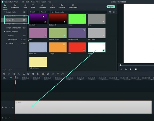
Step 2
Once the program starts, open a New Project. Then, go to “Sample Color” and drag any color you want to the Timeline.
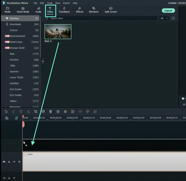
Step 3
Now, head over to the “Titles” tab and drag the Basic Title to the Timeline. Place it above the Sample Color clip.
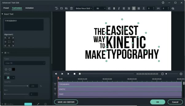
Step 4
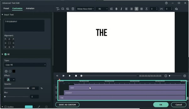
Right-click on the Title clip in the Timeline and select Edit Properties from the menu. From there, click on “ADVANCED” to open the advanced settings. Here, you can change the font, adjust the text size, and place your titles wherever you want on the screen.
Step 5
Now, start with the second text layer from the bottom and move it 5 frames forward. Move each text layer above 5 layers forward from the previous layer. This will display each word a few milliseconds after the previous one.
When you’re done, click OK.
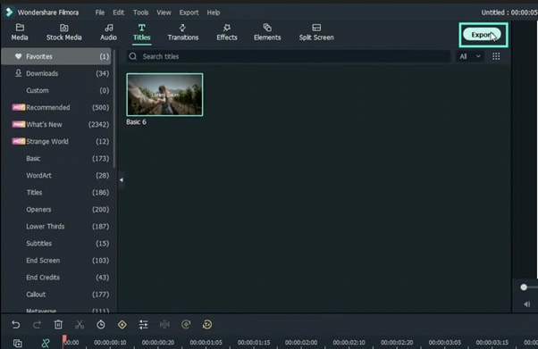
Step 6
Export the Timeline to save your text animation as a new clip.
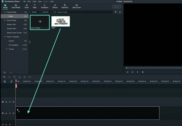
Step 7
Now, delete all the clips from the Timeline and import the text video you just exported. Drag it to the Timeline.
Step 8
Right-click on the clip in the Timeline and go to Edit Properties.
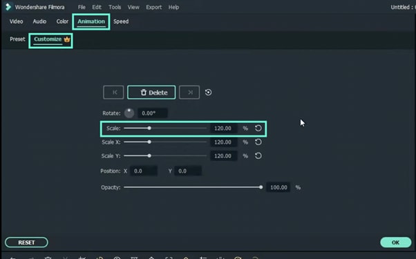
Step 9
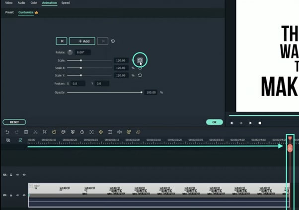
Click on the Animation tab. Then, go to the Customize tab. Here, change the Scale setting to 120%.
Step 10
Next, move the Playhead to the end of the clip in the timeline. Then, reset the Scale and click OK.
Step 11
Watch the final preview. Then, Render and Export the video and you’re done. Congratulations.
Summary
What you’ve learned:
- How to create a kinetic movement effect on text in Filmora
- How to adjust the scale of a video in Filmora
- Adjust and manipulate text layers
What you need to prepare:
- A computer (Windows or macOS)
- Your video materials.
- Filmora video editor
Step 1
Go ahead and download the Filmora video editor before all else. The program will install and start automatically. Just hit “Download” and then “Install”.
Step 2
Once the program starts, open a New Project. Then, go to “Sample Color” and drag any color you want to the Timeline.
Step 3
Now, head over to the “Titles” tab and drag the Basic Title to the Timeline. Place it above the Sample Color clip.
Step 4
Right-click on the Title clip in the Timeline and select Edit Properties from the menu. From there, click on “ADVANCED” to open the advanced settings. Here, you can change the font, adjust the text size, and place your titles wherever you want on the screen.
Step 5
Now, start with the second text layer from the bottom and move it 5 frames forward. Move each text layer above 5 layers forward from the previous layer. This will display each word a few milliseconds after the previous one.
When you’re done, click OK.
Step 6
Export the Timeline to save your text animation as a new clip.
Step 7
Now, delete all the clips from the Timeline and import the text video you just exported. Drag it to the Timeline.
Step 8
Right-click on the clip in the Timeline and go to Edit Properties.
Step 9
Click on the Animation tab. Then, go to the Customize tab. Here, change the Scale setting to 120%.
Step 10
Next, move the Playhead to the end of the clip in the timeline. Then, reset the Scale and click OK.
Step 11
Watch the final preview. Then, Render and Export the video and you’re done. Congratulations.
Summary
What you’ve learned:
- How to create a kinetic movement effect on text in Filmora
- How to adjust the scale of a video in Filmora
- Adjust and manipulate text layers
Detailed Steps to Rotate Videos Using OBS
Obs is video editing software that is used to create and edit videos. It is a powerful tool that can be used to do a variety of things, such as add text, music, and special effects to videos. It also allows you to cut and trim videos, and to merge them with other videos. Additionally, obs allows you to live stream your videos, which can be a great way to share them with others. Overall, obs is a powerful tool that can be used to create and edit amazing videos.
The main interface of Obs Studio is relatively simple, and it is easy to use. The top of the screen contains a number of icons that allow you to access different features of the software, such as the video editor, the live streamer, and the settings. The bottom of the screen contains a timeline, which allows you to easily edit your videos. The timeline also contains a number of tools that allow you to trim your videos, add text and music, and more. Overall, the main interface of Obs Studio is simple and easy to use.
There are many benefits to using obs, including:
- It is free to download and use.
- It is a powerful tool that can be used to create and edit amazing videos.
- It allows you to live stream your videos, which can be a great way to share them with others.
- There are many online communities where you can find help and advice from other users.
- Overall, obs is a great program that can be used to create and edit amazing videos.
There are many reasons why you might want to rotate a video. For example, if you captured a video of a person or object upside down, you would want to rotate it so that it is right-side up. Or, if you recorded a video in landscape mode but want to view it in portrait mode, you would need to rotate the video.
Luckily, there are a number of ways to rotate videos on different devices. In this article, we will show you how to rotate videos using Obs.
Step-by-step on how to rotate videos using Obs
How to rotate using the rotate tool in the video editor?
First, to use the rotate tool in the Edit tab, simply follow the steps below:
Step 1: Open the video editor and drag your video to the editor.

Step 2: Click on the Edit > Transform > Rotate 90 degrees CW tool to rotate it 90 degrees clockwise.

Step 3: Click on the Edit > Transform > Rotate 90 degrees CW tool to rotate it 90 degrees counterclockwise.

Step 4: Click on the Edit > Transform > Rotate 180 degrees tool to rotate it 180 degrees.

How to rotate using the advance controls in obs?
Second, to use the filters in obs, follow the steps below:
Step 1: Open obs and click on the Edit tab > Transform > Edit transform. You can also click Ctrl + E.
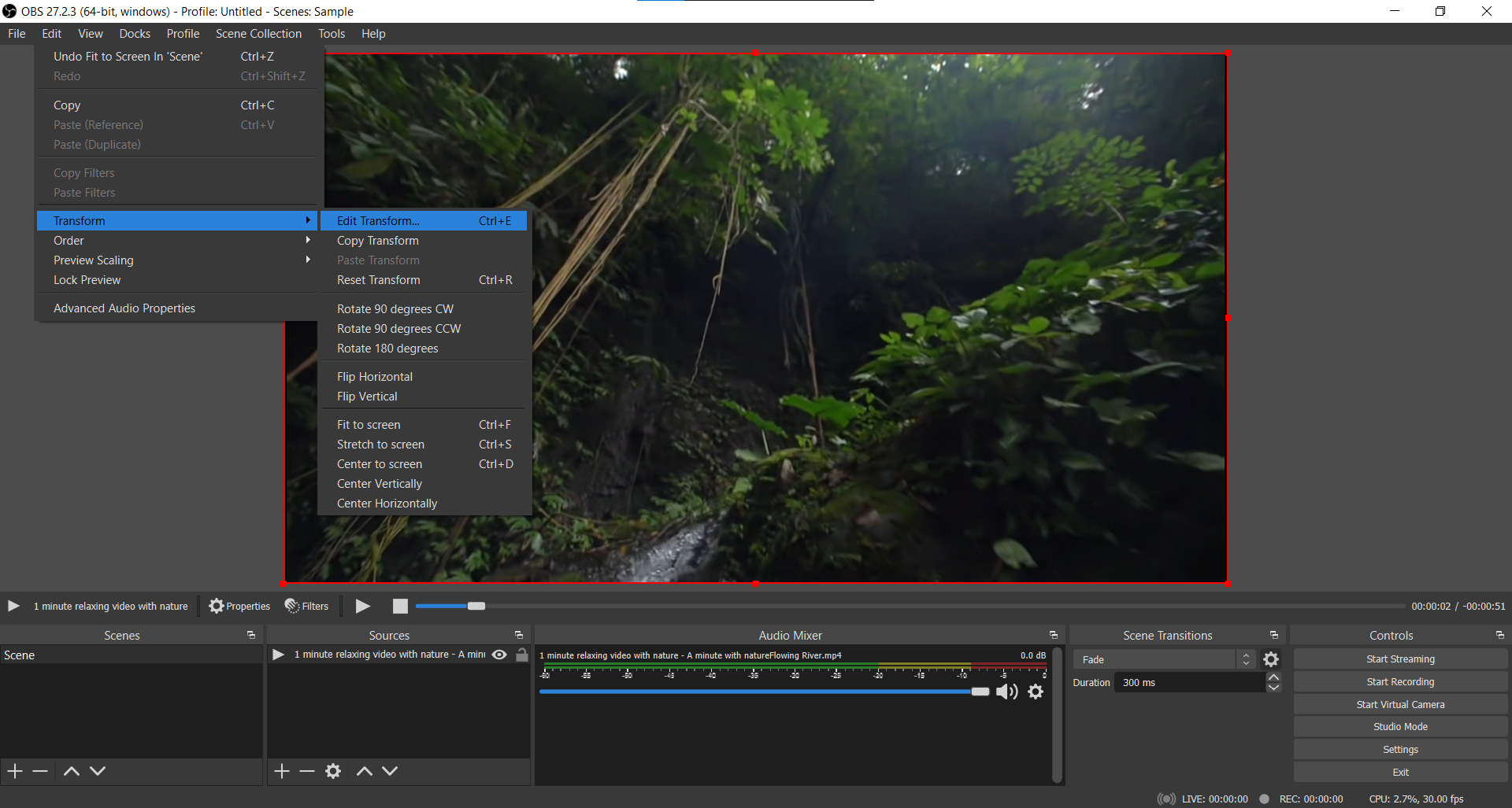
Step 2: Go to the Rotation section.

Step 3: Select the rotation degree you want to use.

Step 4: Click on enter on your keyboard to rotate it.
How to rotate using right-clicking on the video?
Third, to use right-clicking on the video, follow the following:
Step 1: Open obs and right-click on the clip that you want to rotate.
Step 2: Click on the Transform > Rotate 90 degrees CW tool to rotate it 90 degrees clockwise.

Step 3: Click on the Transform > Rotate 90 degrees CW tool to rotate it 90 degrees counterclockwise.

Step 4: Click on the Edit > Transform > Rotate 180 degrees tool to rotate it 180 degrees.

An Easy Way to Rotate Videos Using Filmora
To conclude, there are a number of ways to rotate videos on different devices. In this article, we have shown you how to rotate videos using Obs. Meanwhile, we have another suggestion which is using Filmora Video Editor to rotate videos. Filmora is a Wondershare product that helps you to rotate videos without quality loss. With its easy-to-use interface, you can rotate videos with just a few clicks. If you are interested in it, please feel free to check the guide below:
For Win 7 or later (64-bit)
For macOS 10.14 or later
Step-by-step on how to rotate videos using Filmora
How to rotate videos using Filmora?
First, to rotate videos using Filmora, follow the steps below:
Step 1: Import the video you want to rotate into Filmora.

Step 2: Click on the “Edit” button in the toolbar.

Step 3: Go to Transform > Rotate.

Step 4: Select the rotation angle you want to use.

Step 5: Click on the ‘Ok’ to rotate it.

Second, if you want to rotate a video and flip it, follow the steps below:
Click on the flip option that you want to use, either upside down or sideways, vertically or horizontally.

Click on ‘Ok’ to apply the rotation and the flip.
Third, if you want to rotate a video by a specific number of degrees, follow the steps below:
To conclude, Filmora provides a number of ways for you to rotate your videos as well as using Obs. If you are looking for an easy way to rotate your videos without quality loss, then Filmora is the best option for you.
Step 2: Click on the Edit > Transform > Rotate 90 degrees CW tool to rotate it 90 degrees clockwise.
Step 3: Click on the Edit > Transform > Rotate 90 degrees CW tool to rotate it 90 degrees counterclockwise.
Step 4: Click on the Edit > Transform > Rotate 180 degrees tool to rotate it 180 degrees.
How to rotate using the advance controls in obs?
Second, to use the filters in obs, follow the steps below:
Step 1: Open obs and click on the Edit tab > Transform > Edit transform. You can also click Ctrl + E.
Step 2: Go to the Rotation section.
Step 3: Select the rotation degree you want to use.
Step 4: Click on enter on your keyboard to rotate it.
How to rotate using right-clicking on the video?
Third, to use right-clicking on the video, follow the following:
Step 1: Open obs and right-click on the clip that you want to rotate.
Step 2: Click on the Transform > Rotate 90 degrees CW tool to rotate it 90 degrees clockwise.
Step 3: Click on the Transform > Rotate 90 degrees CW tool to rotate it 90 degrees counterclockwise.
Step 4: Click on the Edit > Transform > Rotate 180 degrees tool to rotate it 180 degrees.
An Easy Way to Rotate Videos Using Filmora
To conclude, there are a number of ways to rotate videos on different devices. In this article, we have shown you how to rotate videos using Obs. Meanwhile, we have another suggestion which is using Filmora Video Editor to rotate videos. Filmora is a Wondershare product that helps you to rotate videos without quality loss. With its easy-to-use interface, you can rotate videos with just a few clicks. If you are interested in it, please feel free to check the guide below:
For Win 7 or later (64-bit)
For macOS 10.14 or later
Step-by-step on how to rotate videos using Filmora
How to rotate videos using Filmora?
First, to rotate videos using Filmora, follow the steps below:
Step 1: Import the video you want to rotate into Filmora.
Step 2: Click on the “Edit” button in the toolbar.
Step 3: Go to Transform > Rotate.
Step 4: Select the rotation angle you want to use.
Step 5: Click on the ‘Ok’ to rotate it.
Second, if you want to rotate a video and flip it, follow the steps below:
Click on the flip option that you want to use, either upside down or sideways, vertically or horizontally.
Click on ‘Ok’ to apply the rotation and the flip.
Third, if you want to rotate a video by a specific number of degrees, follow the steps below:
To conclude, Filmora provides a number of ways for you to rotate your videos as well as using Obs. If you are looking for an easy way to rotate your videos without quality loss, then Filmora is the best option for you.
Also read:
- How Do You Create In-Camera Transitions in Your Videos? A Complete Guide for Beginners to Create These Transitions Using Their Camera at Home
- New In 2024, Create Perfect Slow Motion Videos With The Best CapCut Templates
- Updated In 2024, Facts About GIF Background You Didnt Know
- Updated In 2024, Add Stylish Text to Videos
- 2024 Approved Do You Wish to Know How FFmpeg Can Remove Audio From a Video? If Yes, Keep Scrolling This Guide to Remove Audio From Video with FFmpeg and Other Alternative Software
- New In 2024, How to to Mimic Professional Filming Gears
- In 2024, Tactics To Make Keynote Slideshow
- 2024 Approved Do You Wish to Design the Perfect Slow-Motion Video on Your Smartphone? Learn some Top-Rated Free Slow-Mo Apps for Android and iOS Users in This Article
- 2024 Approved How to Edit a TikTok Video After Posting
- 2024 Approved How to Add Filters on iMovie
- Updated Create Your Own Subscribe Channel Graphics for 2024
- New Hard to Remove Black Background in After Effects, In 2024
- Updated How to Make Video Slow Motion, In 2024
- In 2024, Are You Looking for the Best App to Prank Your Friends? Here Is a Complete Guide on the Funcall App, How to Use It to Change Your Voice, and Its Best Alternatives
- New Top 10 Best Free Video Compressors
- New In 2024, How to Create Vintage Film Effect 1990S
- Updated Learn Topaz Video Enhance AI Review
- New 2024 Approved How to Do Velocity Edits on PC
- Updated How to Make Discord Emoji GIF
- Updated In 2024, How to Livestream Zoom on Facebook?
- New To Add SRT to MP4 Is Not as Hard as You Might Think. All You Just Need Is the Right Tool to Help You Get the Job Done. Read This Article and Learn the 8 Latest Methods to Merge SRT with MP4 Effortlessly
- Updated 2024 Approved How to Blur Faces in Your Video on iPhone
- This Article Will Help You Understand How to Create Video Contents that Convert Sales for 2024
- In 2024, Best Cinematic LUTs For Premiere Pro Recommendation
- New Top 20 Best Text To Speech Software Windows, Mac, Android, iPhone & Online for 2024
- 2024 Approved Looking for Exciting Methods to Create Alluring GIFs Worthy of Making a Mass Appeal? Heres All About GIF Design You Will Ever Want to Know and Learn
- Updated In 2024, What Is Animated GIF | GIF Example & Advantages of GIF
- New 10 Best Free Text to Speech Software Windows, Mac,Android, iPhone & Online for 2024
- Updated 2024 Approved 10 Best Camera for YouTube Beginners
- In 2024, What If YouTube Zoom to Fill Not Working?
- New In 2024, How To Change Text In Premiere Pro
- Updated Lets Create a New Premiere Pro Project, Import some Video, and Control Video Playback Speed. Also, Find Alternative Software (WonderShare Filmora) to Control Playback Speed in Minutes
- In 2024, 6 Instant Mp4 to GIF Online Tools
- New How to Rotate Video in iMovie with Alternative for 2024
- Updated 10 Top Suggestions for AI Video Interviews for 2024
- In 2024, A Complete Guide to the Best Brand Story Videos
- 2 Actionable Ways to Extract Subtitles From MKV Videos without Quality Loss
- 2024 Approved Let Us Help You with Something that You Might Not Know. Have You Ever Worked with MOV File Format Before? Or Do You Know What that Is? Lets Talk About It
- New In 2024, How to Speed up a Video on Splice
- 2024 Approved Are You Looking for Ideas for Funny YouTube Videos? Your Search Is Over. Read the Article Below and Get the Most Information Regarding Funny Videos. You Will Also Get to Know About the Best Funny Video Background Music
- How to Speed Up Video with Canva Online Tool for 2024
- 2024 Approved How to Add Adjustment Layer (Clip) in DaVinci Resolve?
- Updated In 2024, Easy Guide to Zoom Video in VLC
- 2024 Approved Top 6 Best Alternatives to Clownfish Voice Changer
- Updated Adding a Spooky Shadow Effect with Filmora for 2024
- How to Use LUTs in Lumafusion & Free Resource for 2024
- Achieving GoPro Slow Motion with Quality An In-Depth Overview for 2024
- Updated Discover the Top Slow Motion Camera App to Use
- New Some Facts That Few People Know on How to Make Transparent Background in Canva
- In 2024, How to Bypass FRP from Samsung Galaxy M34 5G?
- Infinix Zero 30 5G ADB Format Tool for PC vs. Other Unlocking Tools Which One is the Best?
- In 2024, Full Guide to Catch 100 IV Pokémon Using a Map On Realme GT 5 (240W) | Dr.fone
- In 2024, Preparation to Beat Giovani in Pokemon Go For OnePlus Ace 2 | Dr.fone
- In 2024, How to Unlock Infinix Note 30 PIN Code/Pattern Lock/Password
- How Can We Unlock Our Nokia XR21 Phone Screen?
- 4 Methods to Turn off Life 360 On Poco X5 Pro without Anyone Knowing | Dr.fone
- Here are Some Pro Tips for Pokemon Go PvP Battles On Poco C65 | Dr.fone
- Pokemon Go No GPS Signal? Heres Every Possible Solution On Itel P55T | Dr.fone
- In 2024, Top 15 Apps To Hack WiFi Password On Oppo Find X7 Ultra
- In 2024, Recommended Best Applications for Mirroring Your Realme 12 5G Screen | Dr.fone
- How to Perform Hard Reset on Samsung Galaxy Z Flip 5? | Dr.fone
- Xiaomi Redmi A2+ won't play MOV videos, how to fix ?
- How to Detect and Remove Spyware on Samsung Galaxy S23? | Dr.fone
- How Do You Get Sun Stone Evolutions in Pokémon For Realme 11 5G? | Dr.fone
- In 2024, How to Transfer Contacts from OnePlus Nord CE 3 5G to iPhone XS/11 | Dr.fone
- Title: How to Add Green Screen Effects In Phhotoshop
- Author: Chloe
- Created at : 2024-05-20 03:37:21
- Updated at : 2024-05-21 03:37:21
- Link: https://ai-editing-video.techidaily.com/how-to-add-green-screen-effects-in-phhotoshop/
- License: This work is licensed under CC BY-NC-SA 4.0.
